BP 10 Volkswagen Think Small.

The Volkswagen “Think Small” campaign used a simple visual effect along with honesty. The VW bug is the only visual graphic in the ad and is small so your eye only has one focus. This can be used in the modern world of web design also. Visually busy websites can be overwhelming for users, especially in older generations. Keeping things simple so users can easily find things like the home icon or call to action is important because it will keep them engaged on the website.

The visual aspect of the ad is unique and an out of the box type strategy that worked very well. The marketing copy is also a unique approach and a fresh strategy. Due to the fact that fast cars were popular at this time and their VW bug did not relate to this trend they had to find another perk to get customers interested. They are very honest with the customer and make it clear that the VW bug is not there to compete with fast popular vehicles of this time period. By being honest with the customer it draws you into reading what the car does offer which is it’s advanced engine and the need for less maintenance. This can be used in modern websites because keeping it honest and true to the brand of the website will keep people coming back. Nobody wants to go on a website for a restaurant and have one idea of what they will be walking into then get there and it be completely different. They also take the brand name Volkswagon and shorten it too VW. This can also be used on websites because simplicity goes a long way when keeping users engaged.

Helmut Krone was an art director and is considered to be a pioneer of modern advertising. Krone’s “Think Small” advertisement for Volkswagen was voted the No. 1 campaign of all time in Advertising Age’s 1999 The Century of Advertising issue.

Julian Koenig was an American copywriter. He is widely considered one of the greatest copywriters in the history of advertising. At the firm DDB, he and Helmut Krone created the legendary “Think Small” and “Lemon” ads for VW  under the supervision of William Bernbach.

William Bernbach was an American advertising creative director. He was one of the three founders in 1949 of the international advertising agency DDB. He was the creative director for the campaign “Think Small”.

DDB had simplicity in mind when coming up with the “Think Small” campaign, contradicting the traditional association of automobiles with luxury. They knew they had to come up with a unique angle. The creative execution broke with convention in a number of ways. Although the layout used the traditional format – image, headline and three-column body were retained, other differences were subtle yet sufficient to make the advertisement stand out.DDB had simplicity in mind when coming up with the “Think Small” campaign, contradicting the traditional association of automobiles with luxury. They knew they had to come up with a unique angle. It used a sans-serif  font at a time when serif fonts were normal. It included a full-stop after the tagline “Think Small.” The body-copy was full of widows and orphans – all designed to give the ad a natural and honest feel. The image of the car was placed in the top left-hand corner and angled in a way that directed the reader’s attention toward the headline. Finally, the ad was printed in black and white, at a time when full colour advertisements were widely used.

“I implore you, value the work that you do. Put so much thought and effort into it that people will still care in fifty years.” The author of this quote is encouraging someone to take the time and effort in your work to stand out from the rest. To not be average in your work ethic but rise above the rest so your final product makes a big enough impression to last a lifetime.
BP 9 Color and Darkness.

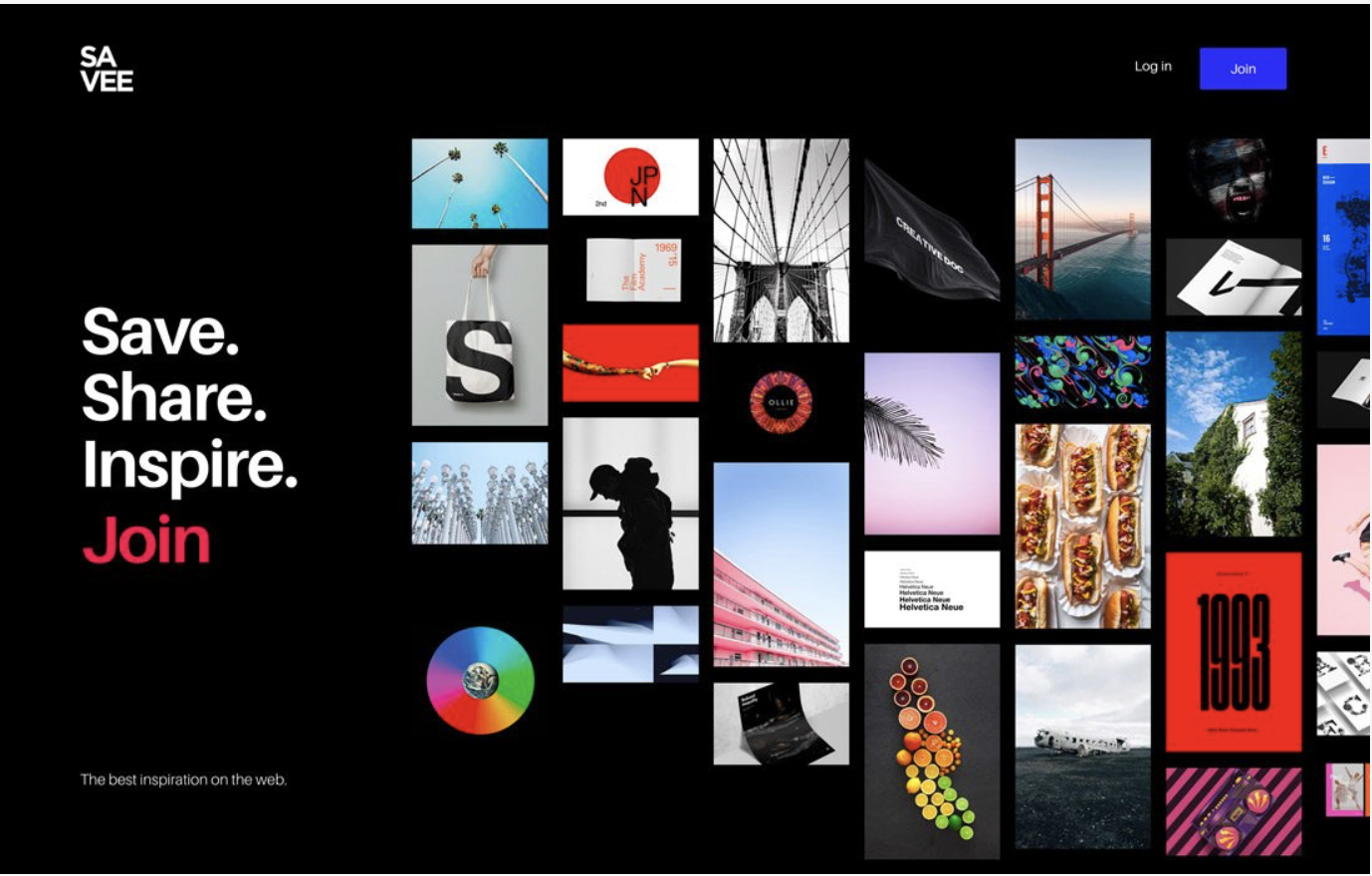
My favorite web design from “Design Trend: Vivid Rainbow Colors” is SAVEE. The bright clear colors with the black background really pops. Unlike some of the other sites with dark backgrounds it is crisp and clean and you are able to locate the call of action as soon as your eyes hit the page. I feel as though you need to be very careful in your planning and layout of this method so visitors eyes don’t get distracted and have to search to hard for call of action.

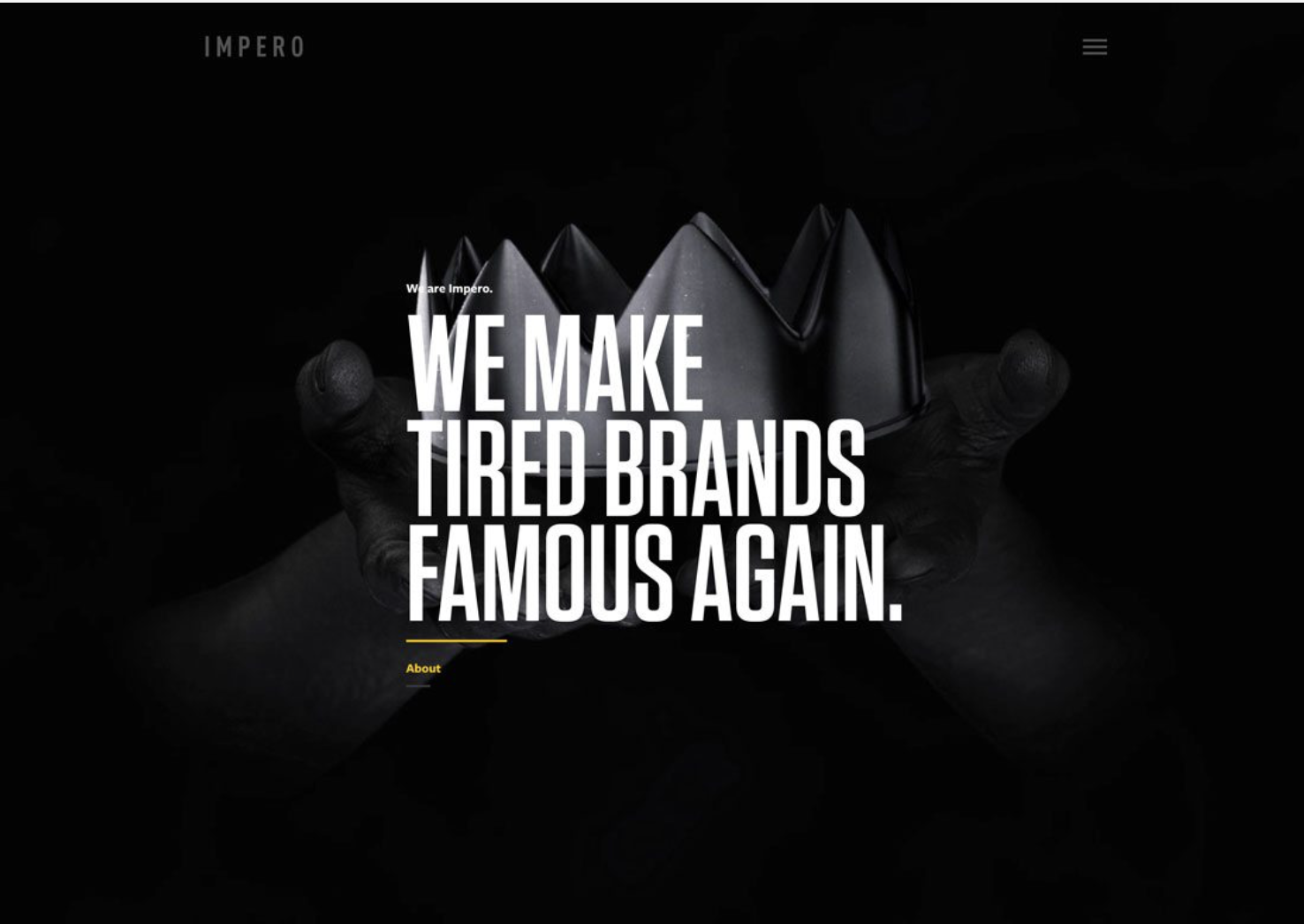
Initially the first website that caught my attention in “Design Trend: Dark Color Palettes & Animation” was Work Play. The account is expired so I was unable to see the animation aspect but I like the simplicity and easy view of call of action. My second favorite is Impero because it also has a clean crisp feel. The call of action is grey and against the black made it a little slower to find. The design is very simple and laid out nice so it is still recognizable pretty quickly.

After exploring different screen sizes with the websites that used vivid color I found that some of them became too busy. The website SAVEE stayed crisp and clean and my eye still easily found the call to action. Some of the others had my eyes wondering when the page had too much going on at a small scale. This was a problem with some of the darker color palettes also, FED EX was open of my least favorites. The call to action buttons were harder to locate when the color wasn’t white or too small.

The use of vivid color is inviting and makes you want to explore the site more when used correctly. It can be used to highlight important aspects of the website that the business wants you to focus on. It is also trendy and can make a website fun so people interact with it more. The use of dark palettes can be used to set a mood and also creates mystery. It is not a trend that works for everything but is great for things like movies, games, and music.

Vivid color and dark palettes are similar because when done correctly they are appealing to the eye and draw you into the site. When viewed at a larger scale both trends have a crisp bold feel and can be used to set either a fun mood with color or a mysterious mood with darks. They both have challenges when it comes to viewing them at a smaller size. It takes someone skilled in each trend to develop a successful appealing website.

BP 8 What Makes a Good Designer.

“What Makes a Good Designer”  by Dmitry Fadeyev is a spot on article. My interest in design came about when I worked in a graphic design and print shop. I was mentored by a few different types of designers in mainly the graphic design advertising material type field. One was my best friend and self taught but his vision, natural creativeness, and ability to connect with the needs of customers was unquestionable. I don’t remember any of our clients coming in and not being completely impressed with his work. These are customers that I see six years later with an identity that works for them because of the connection my best friend has with knowing his customers needs and not just being able to design something. On the opposite spectrum I have also worked with designers that had some of the best education. Customers would come in and one of these people could go to town on his keyboard and have a logo pop up ten minutes later. Even I was impressed by the technical aspect of his abilities but customers would spend hours with him unhappy with the results. Multiple changes would have to be made and a lot of time was wasted with results that didn’t make sense for the customer. In the world of design, you not only have to know what your doing but you must also have the ability to connect with the needs of your customer and the needs of their customer base.

BP 7 How to Design Your Website for Better User Experience.

A User Value Proposition or UVP is the one thing that will determine whether or not a user on your website will stay or leave. It is a statement that clearly explains the product or service you are providing, it’s benefits, and why they should choose you over their competitors.

Above the fold on a web page refers to the portions of a webpage that are visible without scrolling. Research shows that above the fold elements attract the most attention. Studies also found that the upper left of the page is where the eyes fixate before going left to right, then they move further down the page.

Call to action buttons main purpose is to get your visitors to do something such as sign up for a free trial or subscribe to a newsletter. Examples :

Five things you should consider from your user’s point of view when designing your website are :

  1. Location : Above the fold elements attract the most attention. Users do scroll but only is what’s above the fold is promising enough.
  2. Visual Illustration : Visuals are effective but make sure they support the value of your proposition and the audiences perceived expectations or it could call into question your sites integrity.
  3. Unique Content : Communicate with your customers and find out why they choose you and what they like about your business. This will allow you to get to know your site users better and create a better experience for them.
  4. What Space : Too much clutter on a website is hard on the eyes and confusing for a user. Adding white space between paragraphs and in the margins is proven to increase comprehension.
  5. Pages that take time to load : A websites loading speed has a huge impact on brand impressions and large amount of users will abandoned a page that takes more than 3 seconds to load.

BP 6 ’90’s Inspired Web Design.

Thinking back on the internet in the 90’s and 2000’s is a bit cloudy. I remember the frustrations of losing connection every time the phone rang. As a teenager, I remember the annoyance of my mom being on the phone to long because the internet was such a new exciting thing. Instant messaging with friends became one of my favorite pass times especially when I was grounded or pretending to use the internet for homework because back then parents had a lot rules then they do now. Although my memory isn’t the best now I’m coming into my 40’s, I vaguely remember it being harder to maneuver through websites and a lot of pop-ups.

The new trend of bringing back early trends of websites is not appealing to me. After checking out links to this trend in the article “The Latest in Web Design? Retro Websites Inspired by the ’90s”, my favorite trend would have to be “Everything Now” that brings back the pop-up style site. I say this with hesitation because I appreciate the newer age sites that are easy to maneuver through. This one brings me back to my teenage years and has a bit of a fun vibe. None of the examples given would be my preferred method of designing a site for someone.

“The Death and Life of Great American GeoCities” is an interesting concept. Just like collectors of video games or old figurines, I see how there would be an interest in keeping old trends from the internet alive. People of that age that were involved in trend setting for that time period and involved in making websites at that time are proud of where it all started. Even though I appreciate the advances in website design, reading these articles and seeing this site brought back a lot of memories from my childhood experiences with the internet.

BP 5: The Web Awards.

Greta Thunberg won the Webby Social Movement of the year award given by the Webby Awards. She uses her internet platform to ignite a global social movement led by youth activists and its attention is used to create change for our climate. Many children are oblivious to our issues involving the state of our climate while many adults ignore it. Greta Thunberg’s goal is bringing awareness for climate justice and giving our youth a voice to create change. I think her approach by recruiting our youth to deliver the message of the severity of our climate crisis is genius. Someone using the internet to get our politicians and adults to listen to the concerns of our youth and their future is working and she is very deserving of this award. Educating our youth and teaching them to stand up for their future is nothing short of amazing.

BP 4 Aquent Survey of Design Salaries.

My history started with a job in a Graphic Design and print shop. I had no experience but was hired on by my best friend who was a Graphic Designer. He knew my love for art and taught me the basics of Graphic Design and printing advertising materials. I quickly fell in love with using my creative personality and designing these materials on a computer. I advanced quickly and was involved in designing many projects for our customers. We were asked on numerous occasions if we designed websites. Many of our customers were in need of a well designed website but it was not a service we offered. Now, five years later I am in college with the goal of being able to offer that service. My goal is to open my own Graphic Design and print shop and be able to offer website design. The job description that best describes what I want to do as a career is being a producer or both print and web/interactive. I feel for any business, having a company who designs your logo and advertising material benefits greatly by using the same company to design your website.

BP 3 Stop Saying Technology is Causing Social Isolation.

The article “Stop Saying Technology is Causing Social Isolation.” in the Huffington Post is an extreme opposite point of view of “Is the Internet Making Us Crazy?” in Newsweek Magazine. To say that any given thing being overused is making us crazy or not effecting us mentally at all seems a bit crazy in itself. The internet is an amazing quick resource for so many things in our lives. Whether it’s a research paper source or a quick way to find a place nearby to go out to dinner with your family, the internet has many perks. Social media connects businesses to customers and helps family and friends stay connected. While there are many perks of the internet I fully feel it has a negative effect on how people relate to each other and causes a disconnect in relationships. I grew up in an age where children were outside actually experiencing things and connecting with other children. Not reading about the experience of doing something and losing out on real human interaction. In my opinion and from what I personally see it absolutely has a negative effect on many types of relationships. Not everything has to be black or white including the use of the internet, there is always a grey area.

BP 2 Is the Internet Making Us Crazy?

I feel like I am part of the majority of people in this world who ignore the never ending warnings against internet use and what it is doing to people mentally. It’s not that I don’t see it or sometimes even read the warnings, I just pass by it and continue to overindulge. This reminds me of the never ending warnings of obesity in the world, the warnings are everywhere we go to eat better and exercise more but a lot of people see it and continue on with their day like they didn’t see it. Although the internet is such a good resource for so many things it is also the perfect outlet for bullying and obsessive overuse. In Tony Dokoupil’s article “Is the Internet Making Us Crazy?” you are given in my opinion an extreme case of somebody who ends up being diagnosed with a form of temporary insanity from obsessive internet use and the new age form of bullying. I have no doubt that the internet effects people mentally in a large range of ways but I also feel that this is an extreme case of someone who probably had some underlying mental health problems already. My concerns lie with the children being raised in this age of internet overuse. Many parents use devices almost as a babysitter for their children and do not monitor their social media accounts. I believe we will see many negative effects of this mentally, socially, and emotionally as these children become adults.

BP 1 A Dao of Web Design

A Dao of Web Design helps someone like me, who has only known Graphic Design and the printable world, undertsand how Web Design differs. The writer John Allsopp has put together a great article describing the general history of web design and the direction it is heading in the future. Although my heart as an artist has always leaned towards the Graphic Design and printable world, web design has always intrigued me. Knowing nothing about it but being one of the people described in this article that could either be extremely annoyed with a poorly designed site or very excited to maneuver through a well put together site. I’ve learned through A Dao of Web Design that my mindset will now have to change as I work towards becoming a Web Designer. So many new rules will apply and I will have to learn how to let go of the control I have had as a Graphic Designer. This is going to be a very hard task for me because I like the control but I think that it may also help me as a Graphic Designer also.